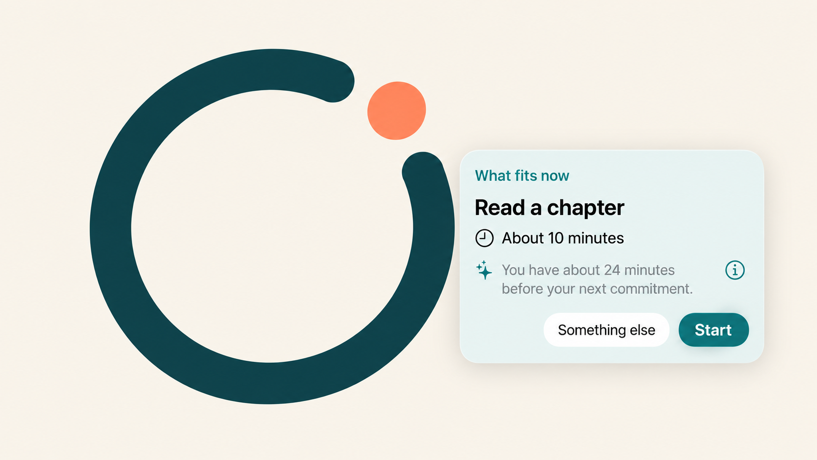
If you have read any of my other posts, you might have noticed a recurring theme: I am quite willing to spend an unreasonable amount of time building something that might, eventually, save me a little time. Custom keyboards, home automation, algorithms for wedding seating arrangements. At this point, I think we can safely call it a pattern.
With A Good Time, I turned my attention to the list of things that I would quite like to get done, but somehow never get around to doing.
There is an awkward category of task that doesn't belong in a calendar. It isn't an appointment, it might not have a deadline, and it can usually wait until tomorrow. Cleaning something, sorting some paperwork, dealing with one of those small household jobs. Put it in a task manager and it stays there, patiently becoming part of the furniture. Give it an arbitrary reminder and your phone dutifully interrupts you at the time you chose several days ago, when you apparently had a much more optimistic understanding of your future availability.
The idea was simple enough: what if the phone could suggest one of these tasks when there was actually a reasonable opportunity to do it?
Of course, most of the interesting work turned out to be hidden inside the word reasonable.
An empty calendar is a rather incomplete picture
The first version of A Good Time was a local iOS proof of concept. It combined task details with calendar availability, place information and, optionally, signals from Screen Time to decide whether to suggest something.
On paper, this looks like a matching problem. A task takes fifteen minutes, you have half an hour, and you are in the right place. Excellent, off you go.
Except that half an hour might be the first break you have had all day. Being home doesn't necessarily mean you have finished arriving home. And having spent some time on your phone doesn't mean you are asking to be rescued from it by a list of chores.
I wanted the app to leave room for all of that uncertainty. It should offer something useful, explain why it might fit, and let you decline without making a small moral judgement about your life choices. There are no streaks to protect or guilt-inducing messages to dismiss. The daily notification maximum is a ceiling; sending fewer, including none, is perfectly acceptable.
This also meant leaving the calendar alone. I use it as an input for availability, rather than filling every gap with automatically scheduled obligations. The entire point was to make those small tasks easier to approach, without turning the rest of the day into a timetable.
Teaching it when to keep quiet
I chose a deterministic decision policy for the timing engine. Given the same tasks and context, it should reach the same conclusion, and I should be able to inspect the reasons.
Some checks are straightforward. A task that requires being home should not appear when you are elsewhere. Something that takes an hour doesn't fit into a twenty-minute gap. Other inputs are preferences: effort, work versus personal context, how busy the day has been, and how recently the app has already interrupted you.
Keeping those two categories separate became surprisingly important. I might generally prefer not to do personal tasks during work hours, but that doesn't make answering one personal email impossible. A preference should influence the choice without quietly becoming a prohibition.
One of the more instructive changes came from a busy-evening scenario. The policy was accounting for a calendar-heavy day, but it was also giving a personal task extra points for appearing outside work hours. Those points could help push an otherwise marginal suggestion over the notification threshold.
Each individual rule sounded reasonable. Together, they could tell me that after a long day of appointments, now would be an excellent time to do something else. Apparently my phone had decided to become a middle manager.
I removed the reward for matching the work or personal context. A mismatch could still count against a task, but merely being a personal task in the evening was no longer a reason to interrupt.
A later revision addressed a related problem: urgency and task age could make something rank highly, even when the timing was poor. I separated task suitability from the decision to interrupt, bounding how much urgency could help justify a notification. An old task can deserve attention without deserving another notification fifteen minutes after the last one.
These situations became regression scenarios, with nearby counterexamples. A busy evening should stay quiet; an ordinary evening should still be able to produce a useful suggestion. Otherwise, it would be very easy to fix every annoying notification by gradually building an app that never does anything.
I accidentally made onboarding into homework
The early project included a small personal experiment comparing fixed-time reminders with adaptive suggestions. The protocol asked for twelve tasks, each taking between five and thirty minutes, and included a calibration period.
That was a way to prepare a reasonably varied set of tasks for a comparison. Unfortunately, the experiment requirements found their way into the ordinary experience: you needed twelve tasks before enabling automatic suggestions.
There is something wonderfully backwards about an app promising to reduce the burden of your to-do list, then refusing to help until you have made it longer.
I removed that requirement. One active task was enough to start. Everyday use and experiment participation became separate choices, and later I retired the fixed-versus-adaptive experiment from the product altogether.
That wasn't evidence that adaptive timing had won. It was a decision about what belonged in the app. The original hypothesis still needed evidence; making every user navigate the machinery for testing it wasn't helping the everyday experience.
The same thinking reshaped onboarding more broadly. Add a task, or try an example, before working through configuration. Choose explicitly between automatic suggestions and asking when you want one. Offer place and Screen Time setup when their benefits are relevant. Let people skip tailoring questions and keep the defaults.
Even the status language mattered. An optional feature that someone has chosen not to enable should not look like unfinished homework. And granting notification permission is different from choosing to receive automatic suggestions. The app needs to make that choice understandable and show what is actually enabled.
Optional has to mean optional
Calendar access exposed another gap between the intended product and the implementation. It was described as optional, but without fresh calendar data the policy could block suggestions. Technically you could decline access. Practically, you had declined much of the app.
I added a path based on the person's declared schedule and commitments. Without a connected calendar, the app has less information, and its explanations need to reflect that. It can say that a task fits your configured schedule; it cannot honestly claim to know that you have no meetings.
There was a similar distinction between an unsolicited suggestion and an explicit request. If my calendar says I am busy but I open the app and ask for something to do, I probably know something the calendar doesn't. The current policy can set aside a busy period already in progress when I ask, while still respecting upcoming commitments and the time needed for the task.
This is the kind of detail I found myself coming back to: how much authority should the app have over an interpretation of my own day? Enough to be useful, certainly, but the person holding the phone should be able to correct it.
Working with the tools people already use
Apple Reminders integration was another early decision. Asking someone to copy their existing backlog into a new app would add work before providing any benefit.
Instead, you can activate selected reminders in A Good Time and add the details needed for suggestions, such as duration, effort and place. Completion synchronizes between the two. Reminders remains responsible for its own fields, while A Good Time keeps its additional information locally.
That boundary became clearer through feedback. An earlier approach used managed metadata in reminder notes. I moved that information into the app's own storage. A person's notes are useful space, and discovering implementation details in them is a fairly poor reward for connecting an app.
The Apple Watch companion followed the same desire to reduce the work surrounding the work. If a suggestion arrives on my wrist, I should be able to accept it and finish the interaction there. Having to find my phone to tell it that I have completed a task somewhat undermines the convenience.
Making that reliable meant treating the Watch, the iPhone and the Live Activity as parts of one interaction. A Done button is only useful if the other surfaces also understand that you are done.
Where AI helped, and where I wanted rules
Although the timing policy is deterministic, entering a task is a good place for language understanding. On supported devices, A Good Time uses on-device models to turn a sentence into a draft with structured details that you can review before saving.
Dates were particularly educational. During testing, a task described as due before November ended up in the following year. Other relative expressions could lose the deadline or become confused with recurrence.
The tempting response was to patch each troublesome phrase with another special case. But I wanted people to write naturally, including in Italian and Spanish, and occasionally make a typo. A growing collection of exceptions would be difficult to maintain and would mostly teach the app to pass the examples I already knew about.
I moved towards giving the model explicit temporal context, separating deadline and recurrence interpretation, and validating the resulting fields. We tested examples on the actual device and used working examples in the capture screen to help people understand what to enter. When assistance is unavailable, the manual form remains useful.
The result still isn't perfect. I was comfortable keeping the best-performing approach while making its output reviewable. Predictable rules are valuable for deciding whether to interrupt someone; interpreting the many ways they might describe next Tuesday is a different problem.
I also explored generating a first step for a task. In an initial small evaluation, the model could produce helpful ideas, but it also invented context and kept offering suggestions when it should have asked a question or left an already-simple task alone. That remained an exploration. Producing a plausible sentence was easy; demonstrating that it would help someone start was the harder part.
Privacy and the price of a small app
An app that combines tasks, calendar availability, places and phone-use signals can learn quite a lot about someone's day. I chose to keep the decision-making and personal context on the device, without an account, a backend or an analytics SDK. Calendar processing retains derived busy intervals rather than event titles, descriptions or attendees.
That choice also shaped how I could learn from the app. Diagnostics and feedback have to be deliberately shared. I don't get a convenient stream of everyone's behaviour, and I need to be careful about what I conclude from the examples I do receive.
It influenced the business model too. I considered a subscription, but the launch direction became a useful free version and a one-time unlock. The core timing quality, privacy and notification controls stay the same; payment adds capacity and capabilities such as the dedicated Watch companion and on-device assistance.
One small decision I particularly liked was making the task allowance a soft cap. If someone creates more tasks during a trial, those tasks remain active when the trial ends. They cannot keep adding beyond the free allowance, but the app doesn't suddenly abandon the things they already entrusted to it.
A one-time purchase doesn't make ongoing maintenance disappear. It felt appropriate for the current product, while leaving willingness to pay and long-term sustainability as questions to test.
The part that took the most thought
Working with coding agents let me explore and revise the implementation quickly. But a substantial part of my involvement consisted of questioning behaviour that was technically correct: why do I need twelve tasks, why did this notification arrive now, why is an optional permission effectively required, why can't I finish this from the Watch?
Those questions were often more consequential than adding another feature. They forced me to make the product's principles concrete, all the way down to a notification threshold, a button, or the wording of a setup screen.
There are still limits. Background opportunities and arrival detection are best effort, and planning a notification doesn't prove it was delivered. A sensible set of rules doesn't establish that the app makes people more productive. Those are things to investigate through actual use, including the occasions when it gets the timing wrong.
What I have built is an attempt to make a small part of the day easier: offer something manageable when it might fit, give the person control, and be willing to stay quiet.
For someone with a long history of trying to optimize everything, spending so much time teaching an app to occasionally do nothing feels like progress.
You can take a look at the app and how it works at agoodtime.to.
Cheers, Lorenzo